Some things are deceptively simple. So simple, that they must always have been there waiting to be discovered, rather than invented. 1
But it still takes that moment of creative genius to take a map of Underground lines and turn them in a diagram, free from geographical restriction and whose only aim is to make life easier for the travelling public.
Harry Beck’s original Underground map (technically a diagram) is a lesson in simplicity, from the spider-web lines to the restricted palette of eight angles. That’s not to say it’s perfect – is Stanmore to Wembley Park a shuttle service? – but in visualising London and the network as a circuit diagram it took the needs of the passenger on board and created something they would find useful. Which they did, and have ever since.
It’s such a well-known design that any transport map that doesn’t follow the same principles can stick out like a sore thumb. They’re correct, but at the same time… just wrong, somehow.
The West Yorkshire experience
Way back in 1979, Metro (or the West Yorkshire PTE, to give it its Sunday name) started financially supporting the local rail network, in common with other PTEs. And, as the rest did, started looking at ways of increasing patronage on those routes. The most obvious way being by creating named or themed routes, and a map to illustrate them.

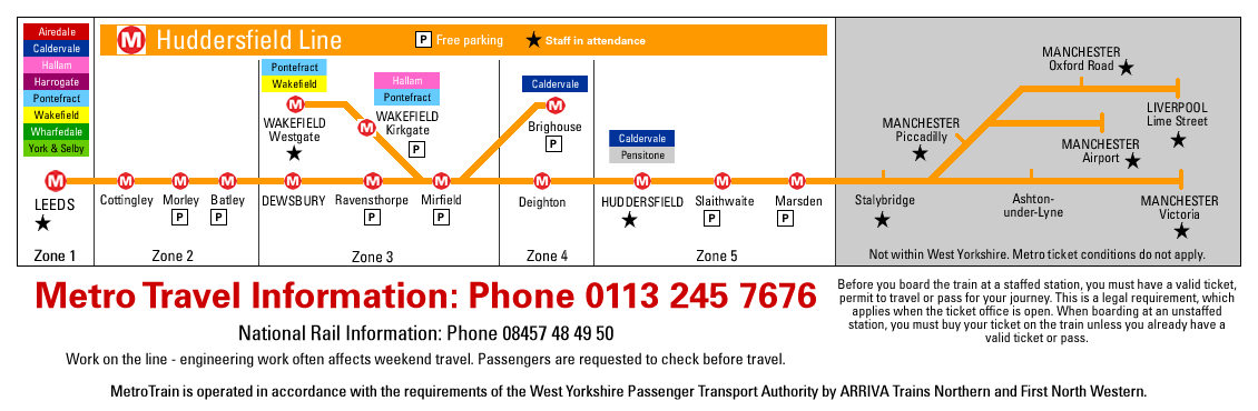
Until 1988, the MetroTrain map looked like this. I can only apologise profusely for the quality of the scan, but this small version was the only one I could find in my extensive collection. Designed in-house, it certainly helped raise the profile of the local rail network and encourage use (lower fares helped a bit as well), but it was undeniably clunky. And a bit difficult to read at this pocket size.
I was on a placement at Metro in March 1988 when the new map was being finalised. It was designed by an external agency that specialised in that sort of thing. By the time I left WYCA in 2016 I was the only person left – by some distance – who’d been involved in some way in its creation, so I always took a dim view when someone tried to do something ‘odd’ to it (I’ll save you the gory details). It wasn’t ‘my’ map, but it felt like I had to defend its honour. I didn’t always win.
Oddly, the Double Royal single line timetable posters still used a variation of the chunky line graphics. But I had been to London, and seen how Beck’s flexible design had been adapted into route diagrams to be displayed inside train carriages. On the basis that imitation is a form of flattery I designed one of my own, took it to the Marketing Manager, she put me in touch with FWT and they designed a set for all of the local lines. It’s something I’m quite proud of, although I couldn’t tell you if they’re still used.

Everything changes
Sadly, the MetroTrain map (now referred to as West Yorkshire’s Rail Network) lost its colours just after I left. Having lines only in black reduces printing costs, apparently… not that WYCA prints timetables any more.
And the Underground map… well, it has changed as well. If you follow this link to the Transport for London website you’ll see a link to something called a Tube Map.
Except it isn’t. It includes London Overground, TfL Rail, trams in Croydon and… the cable car link. Which is about as not-Underground as you could get. And we haven’t got Crossrail yet.
That’s not to deny its usefulness, but it clearly isn’t a Tube/Underground map. It’s somewhere between Beck’s original and the London Connections map he also inspired, restricted just to those services TfL has some form of control over – hence the lack of Thameslink. For the passenger, it’s either too crowded with routes you don’t need or incomplete because it’s missing parallel, national rail routes.
- We’ve had a similar conversation before.[↩]